Case Study · E-learning Platform
Educraft
Modern e-learning platform designed for course discovery
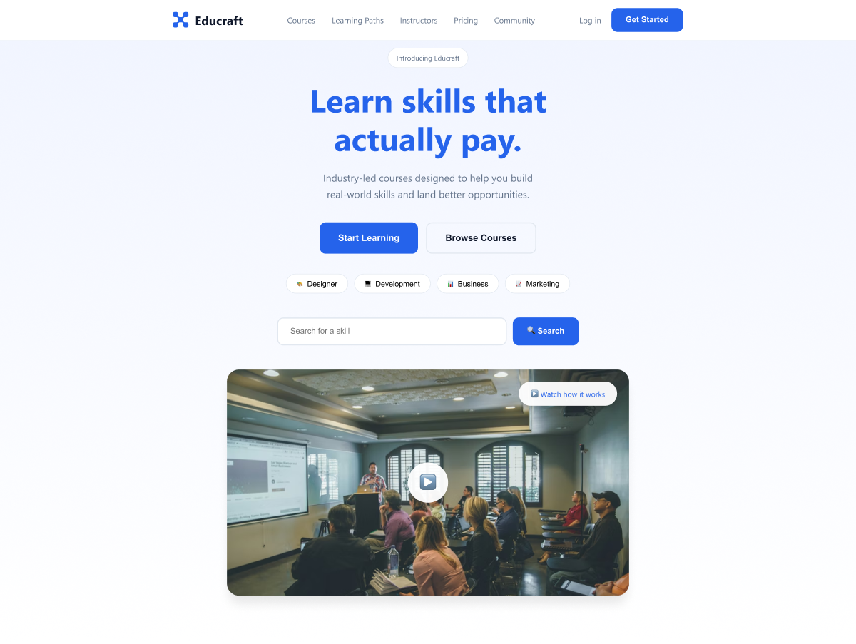
Educraft — Hero section overview
Modern e-learning platform designed for course discovery
Educraft — Hero section overview
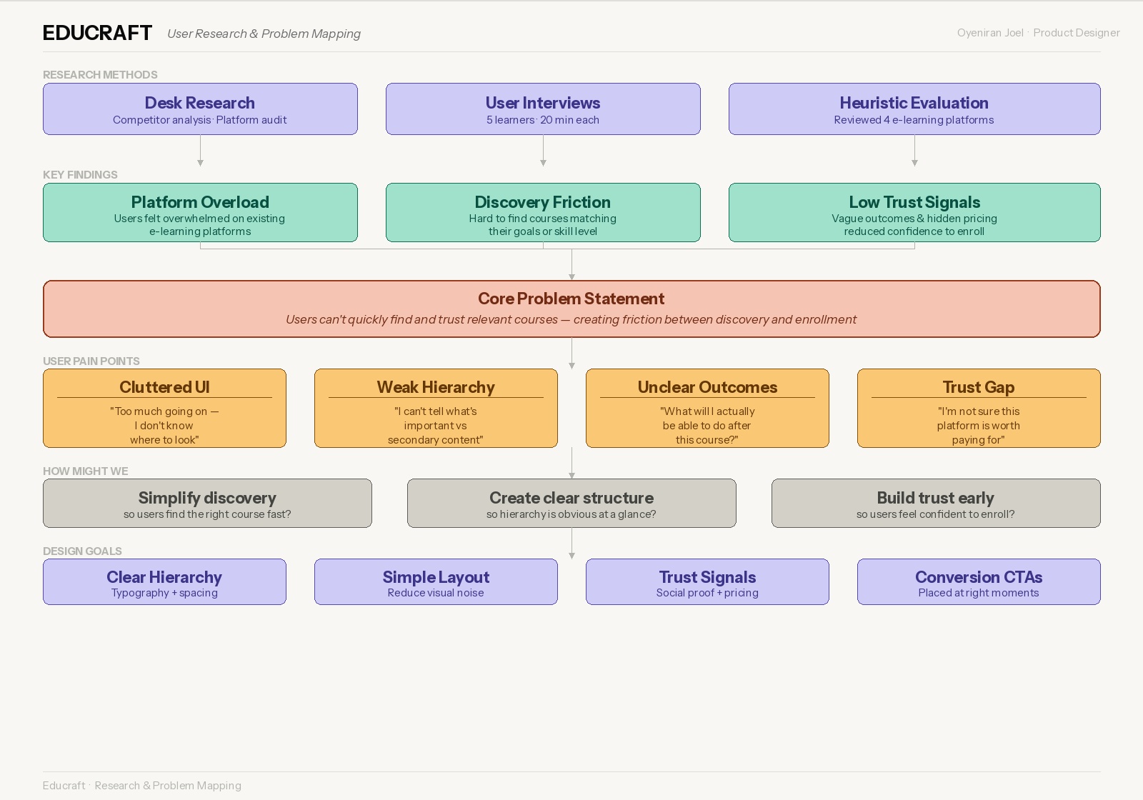
User pain point mapping
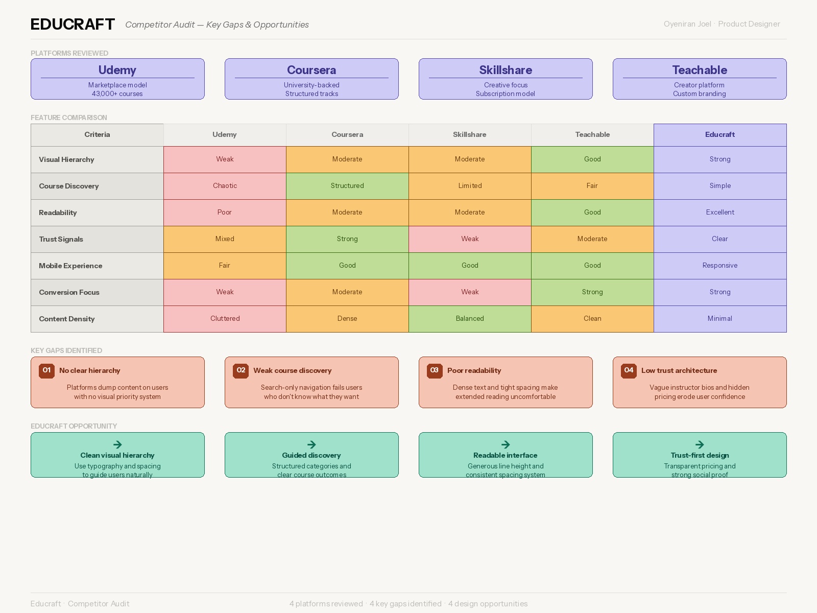
Competitor audit — key gaps
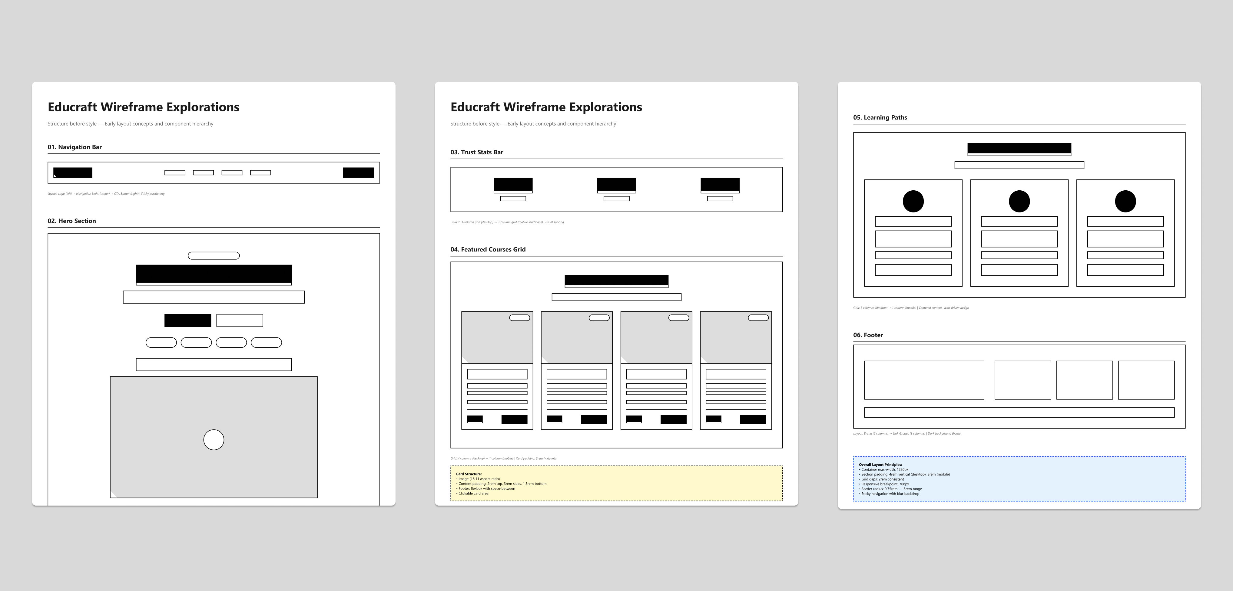
Early wireframe explorations — structure before style
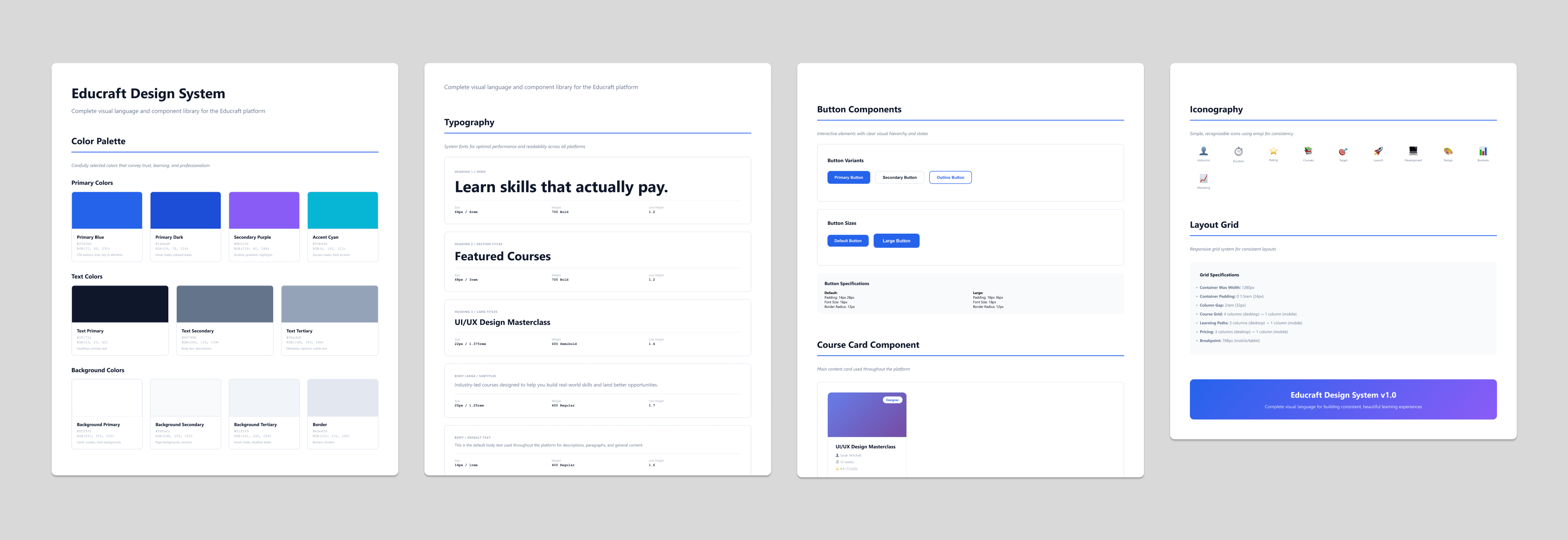
Complete Design System
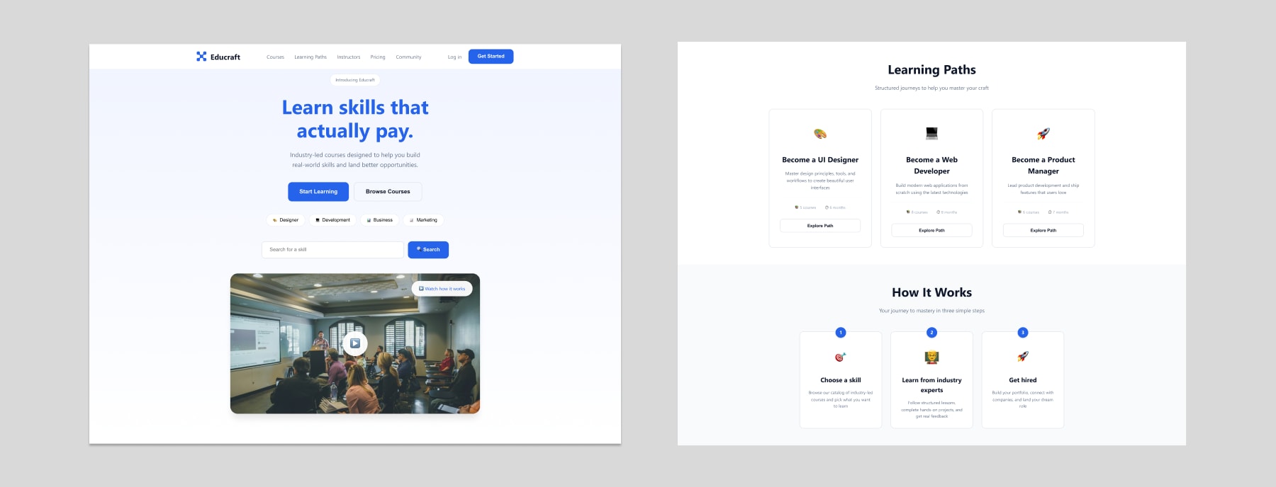
Homepage
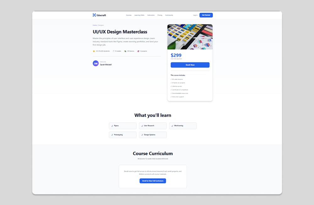
Course View
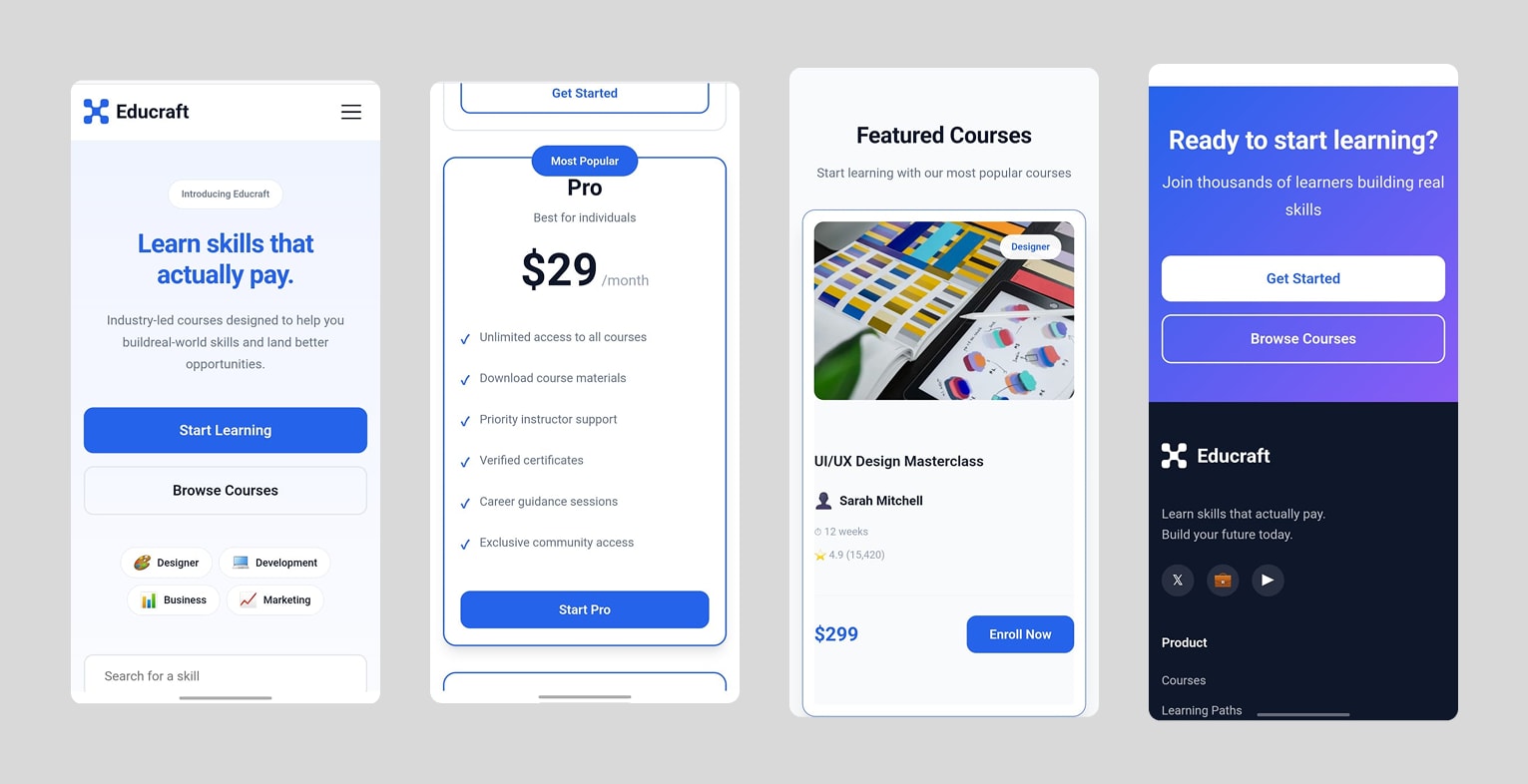
Mobile Experience
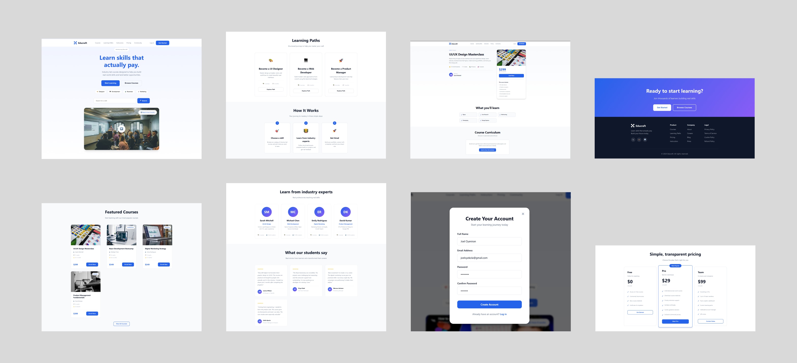
Educraft — key screens at desktop breakpoint
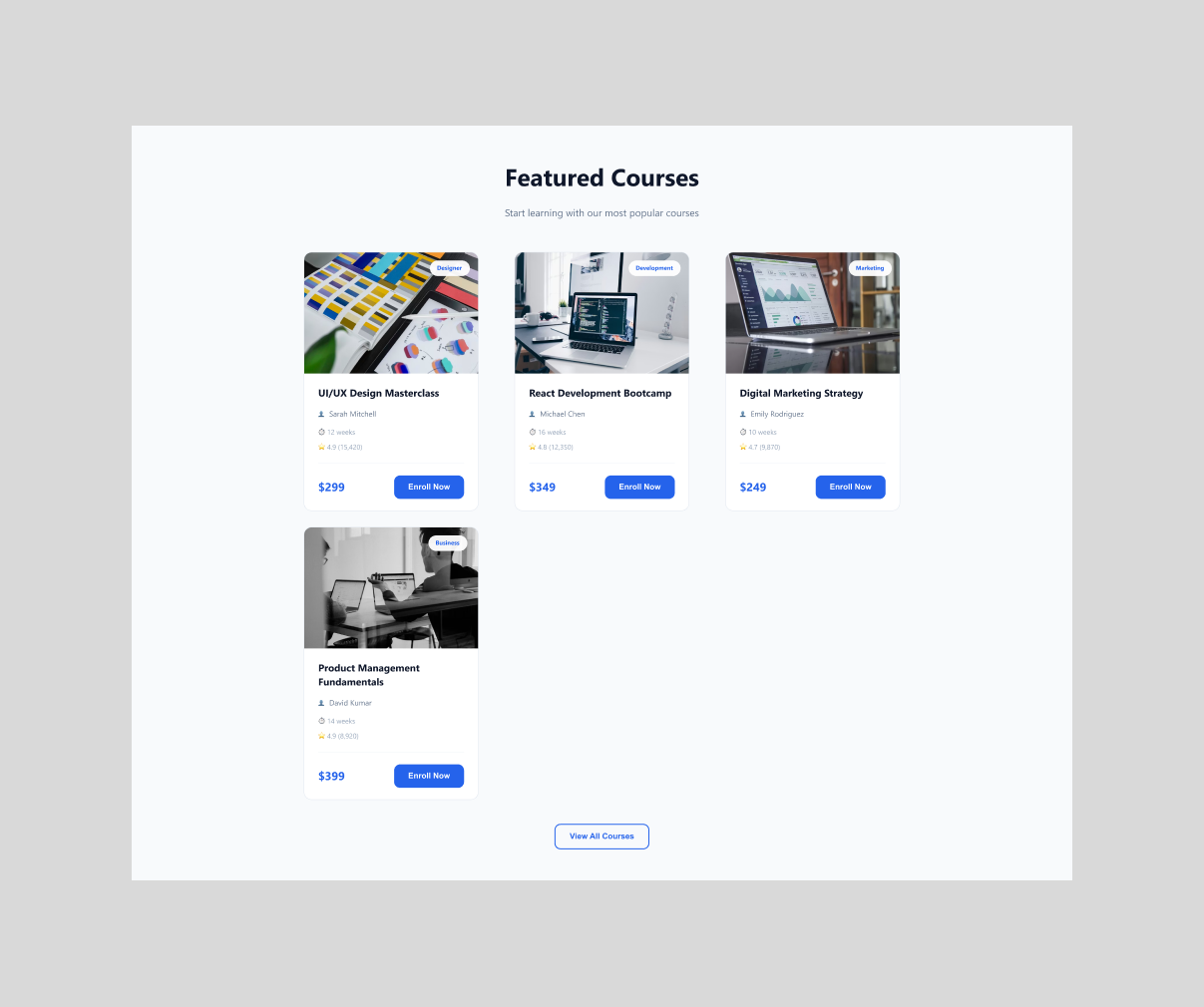
Course section — card layout
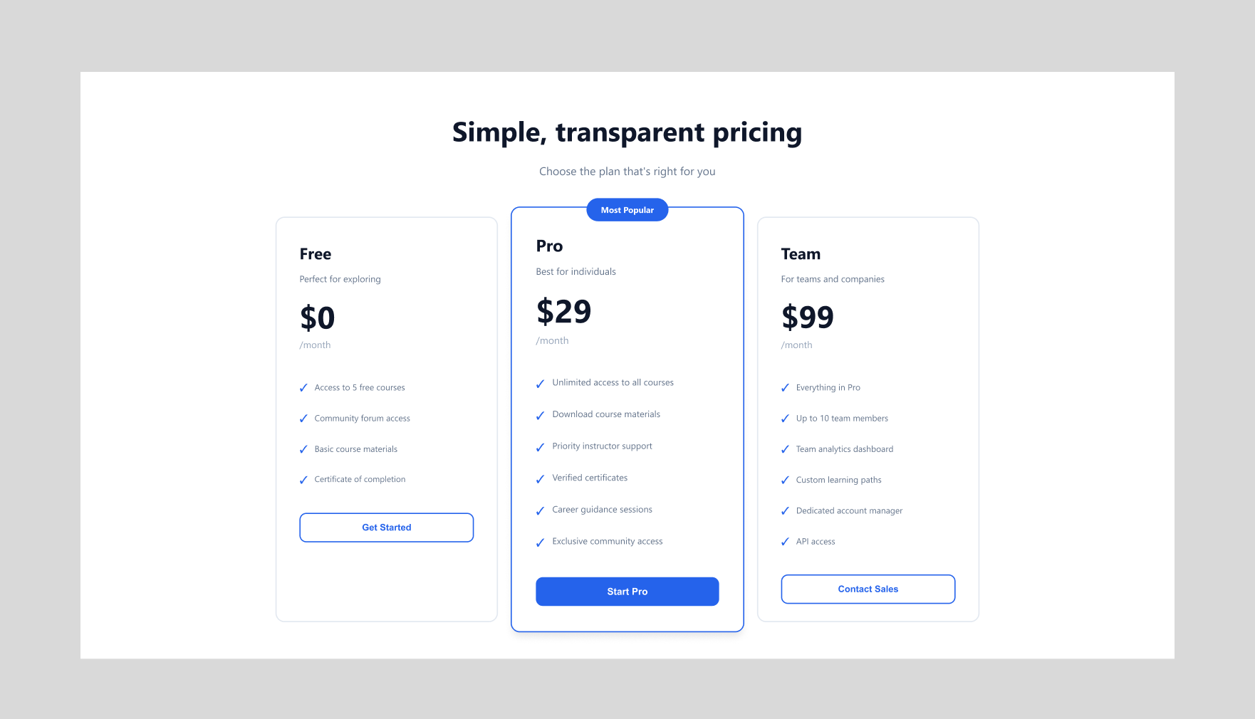
Pricing — three-tier layout
Translated into a responsive live product using Figma and Claude AI for rapid iteration.
A focused, modern interface that simplifies course discovery and drives enrollment.
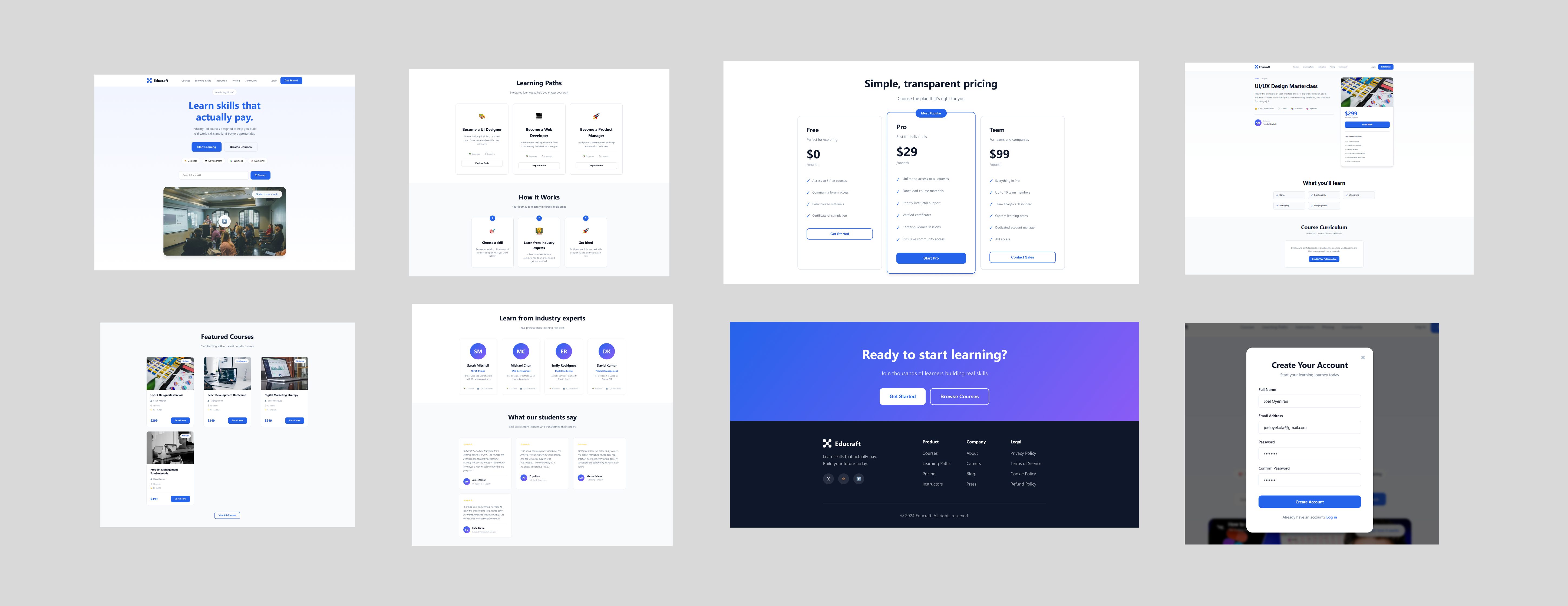
Educraft — final design, full-page view
See the live product
View Live Site ↗