Case Study · UX/UI Redesign
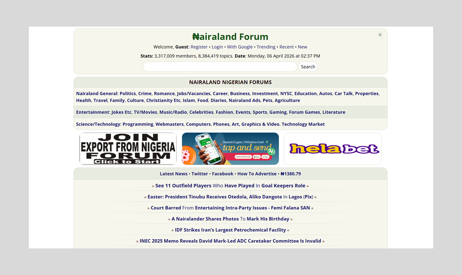
Nairaland
Nairaland
Redesign
Modern redesign of Nigeria's largest forum
Full overview
Modern redesign of Nigeria's largest forum
Full overview
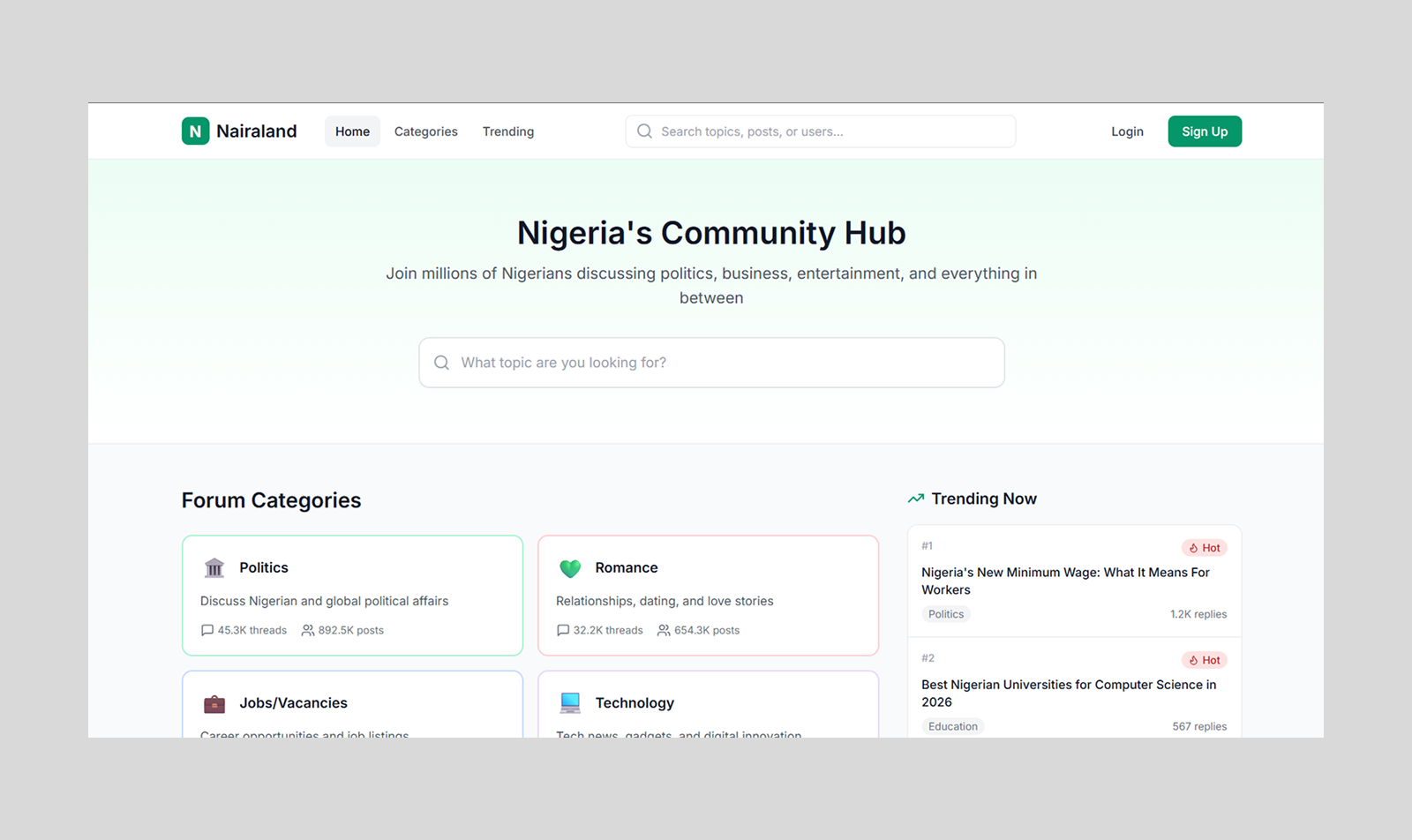
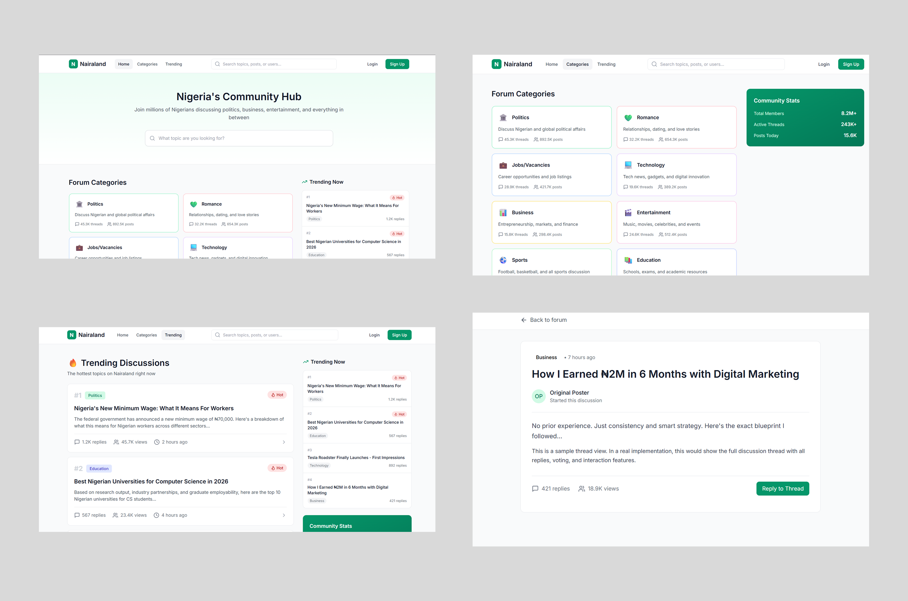
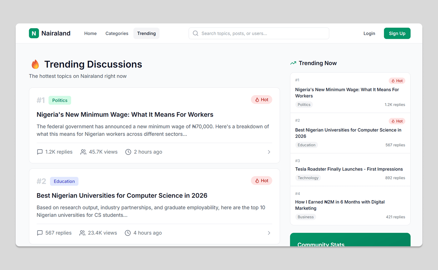
Homepage redesign
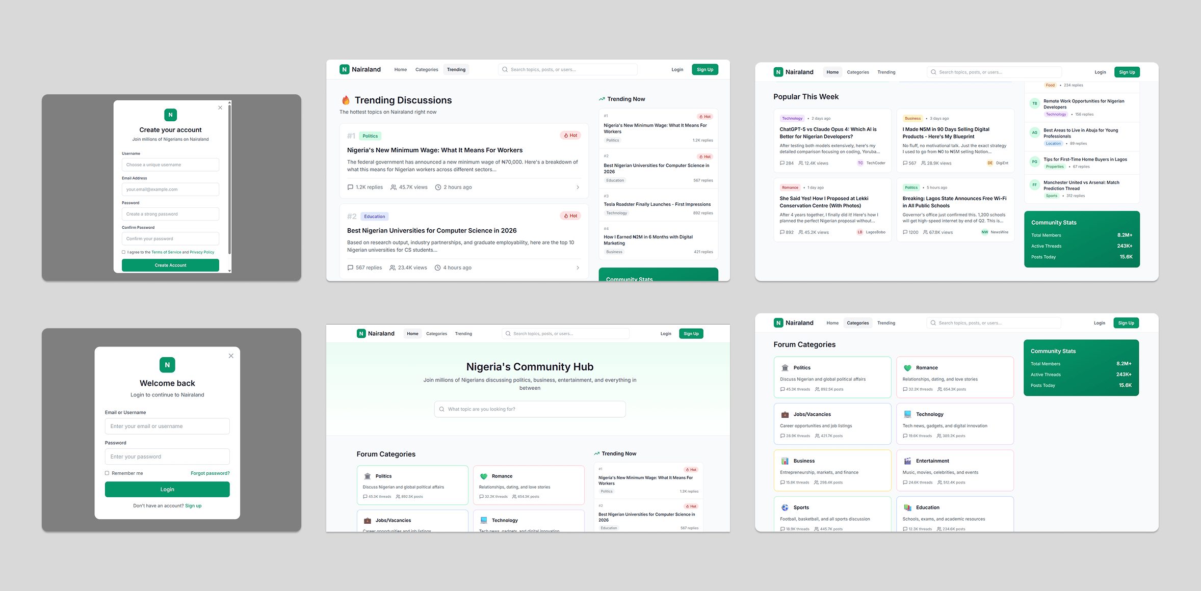
The goal was to redesign the platform in a way that modernizes the experience without disrupting the familiarity users already have with it.
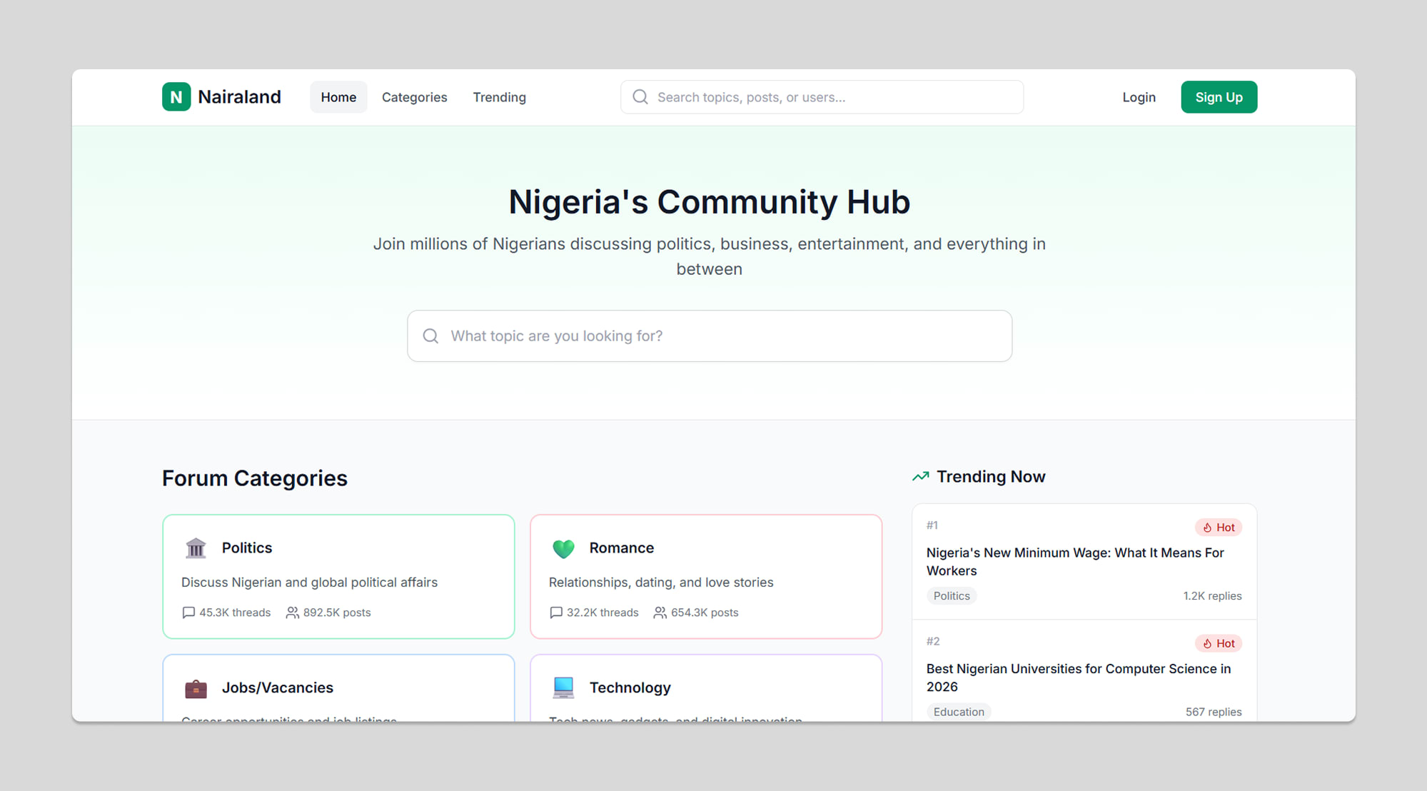
Homepage redesign
Thread view
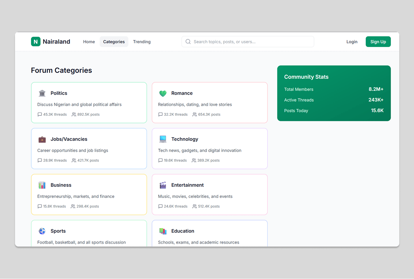
Category navigation
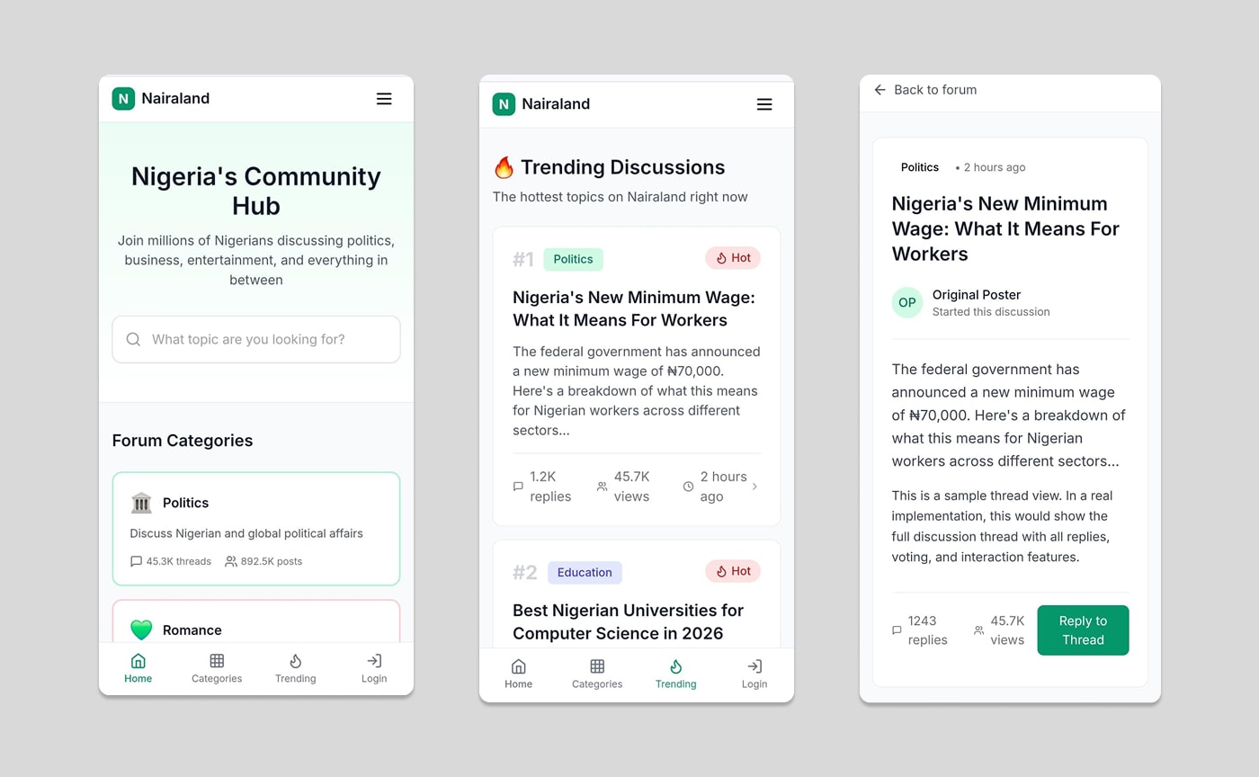
Mobile view
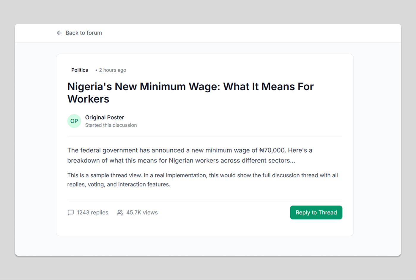
Post details
Thread detail
See the live product
View Live Site ↗